KeyPort Visual Identity Design
KeyPort Visual Identity Design
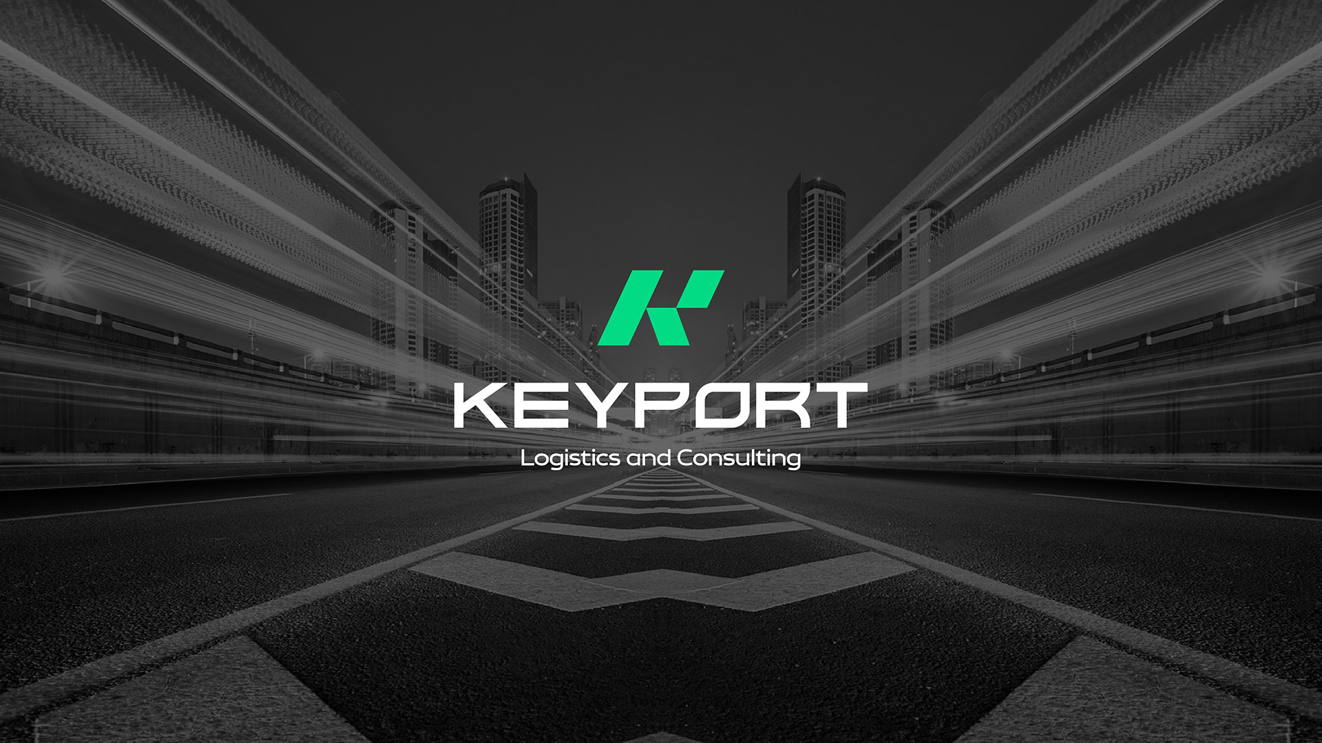
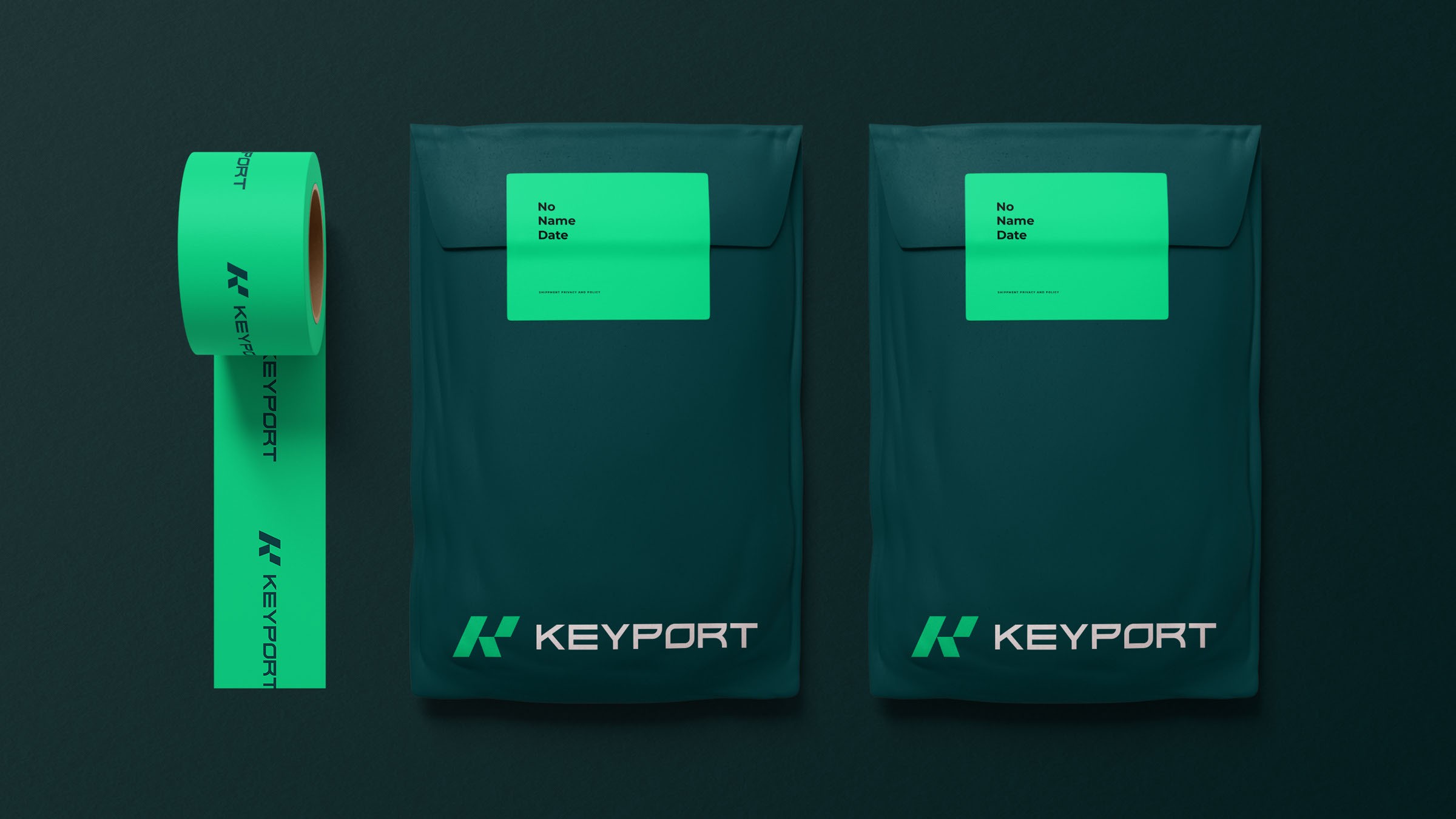
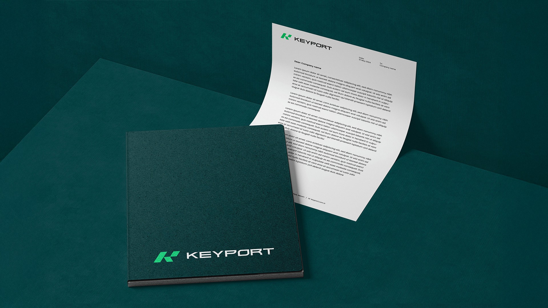
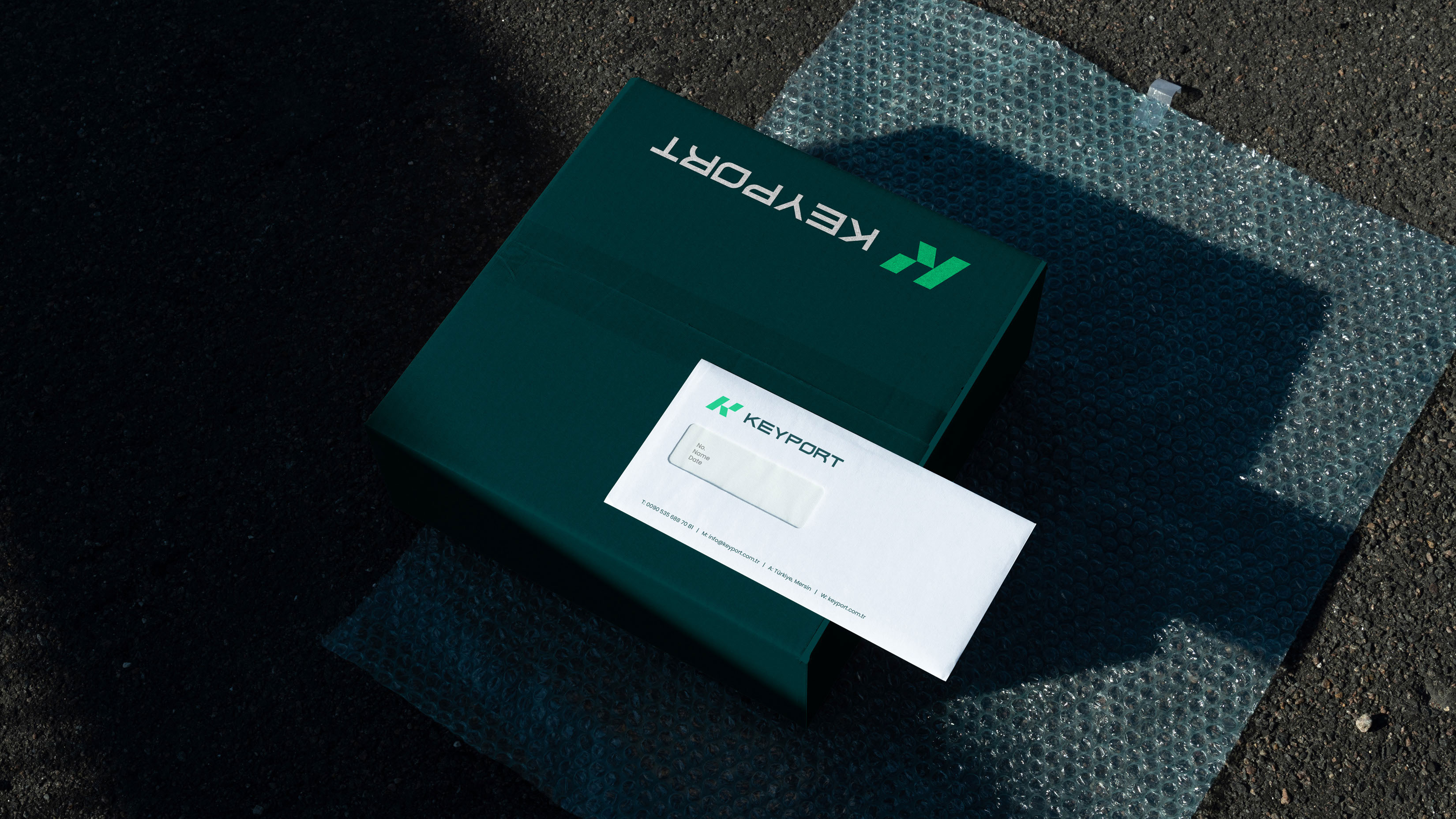
KEYPORT
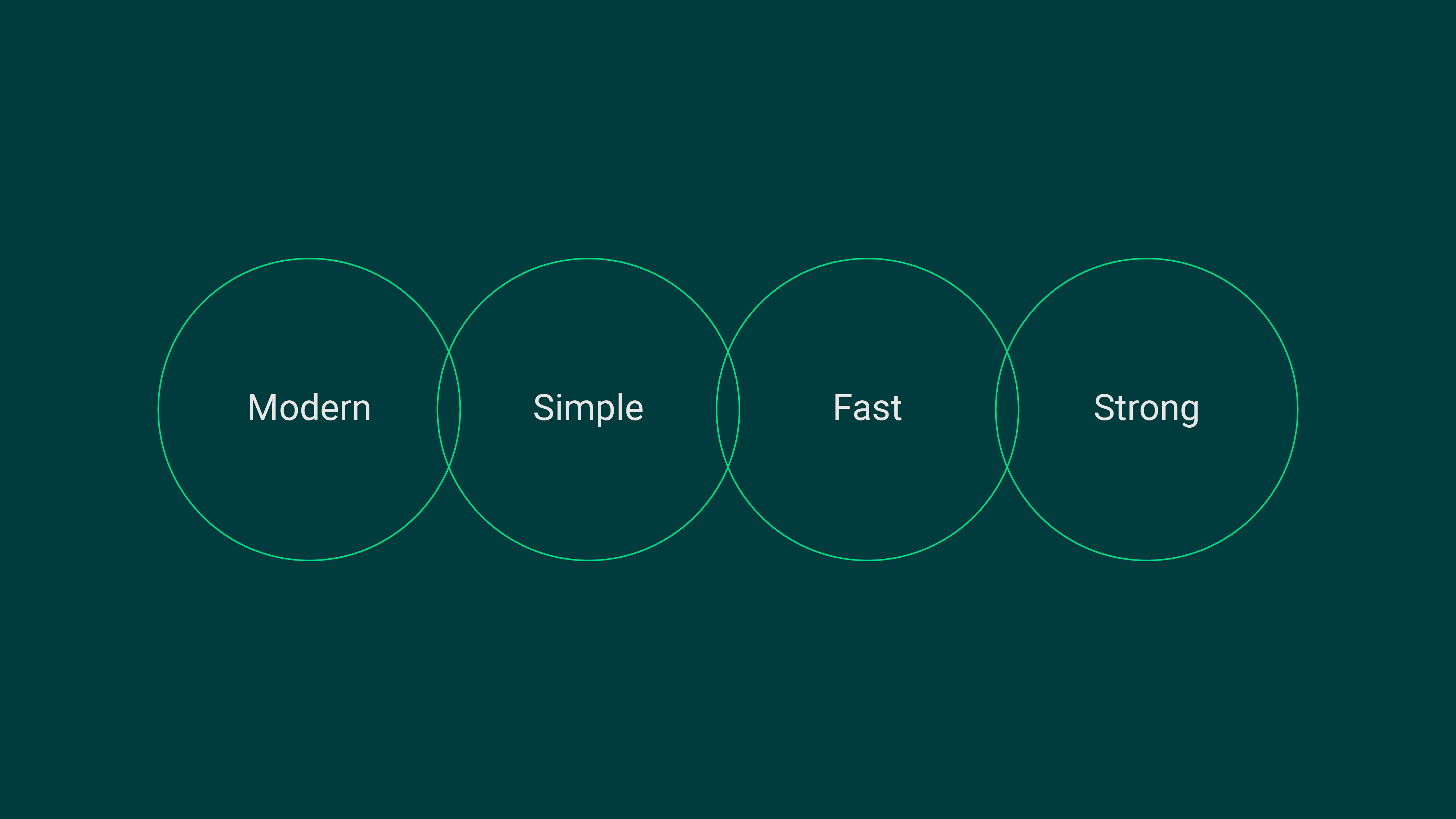
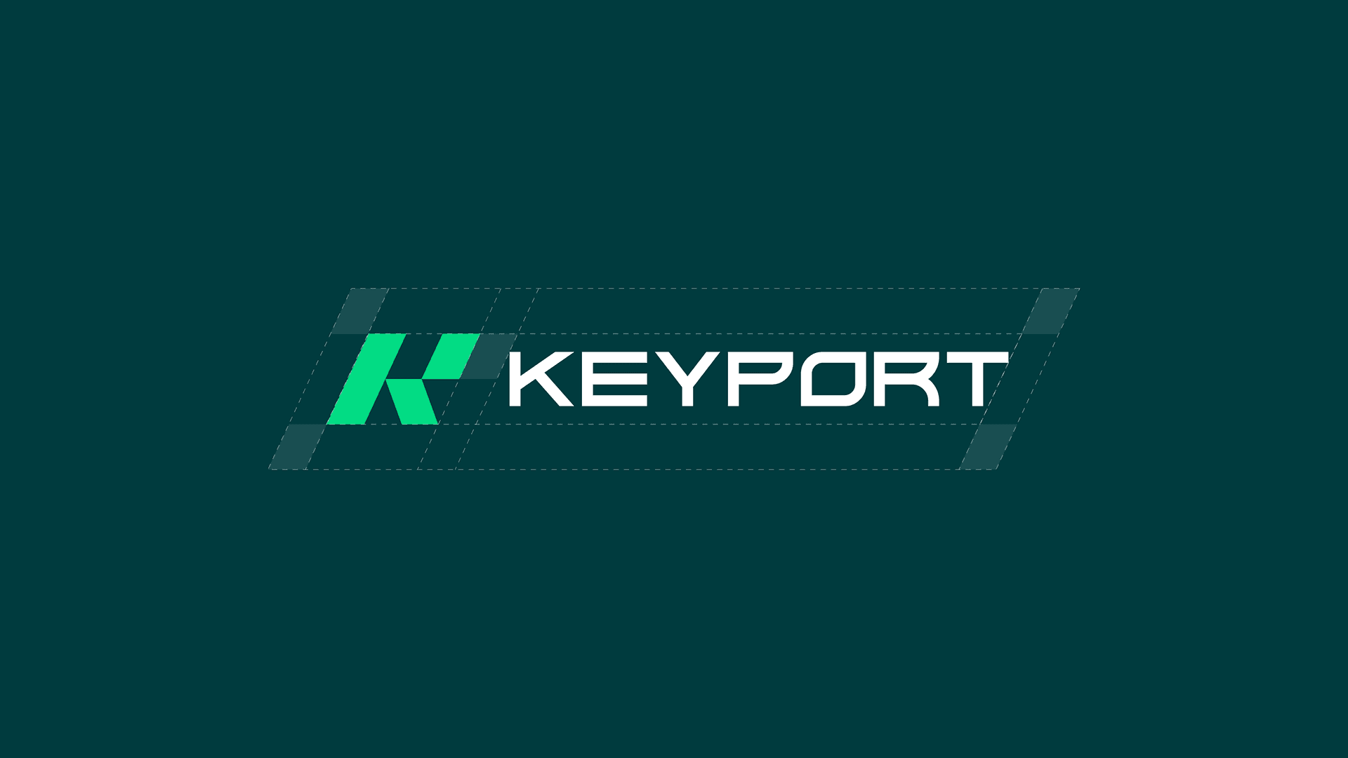
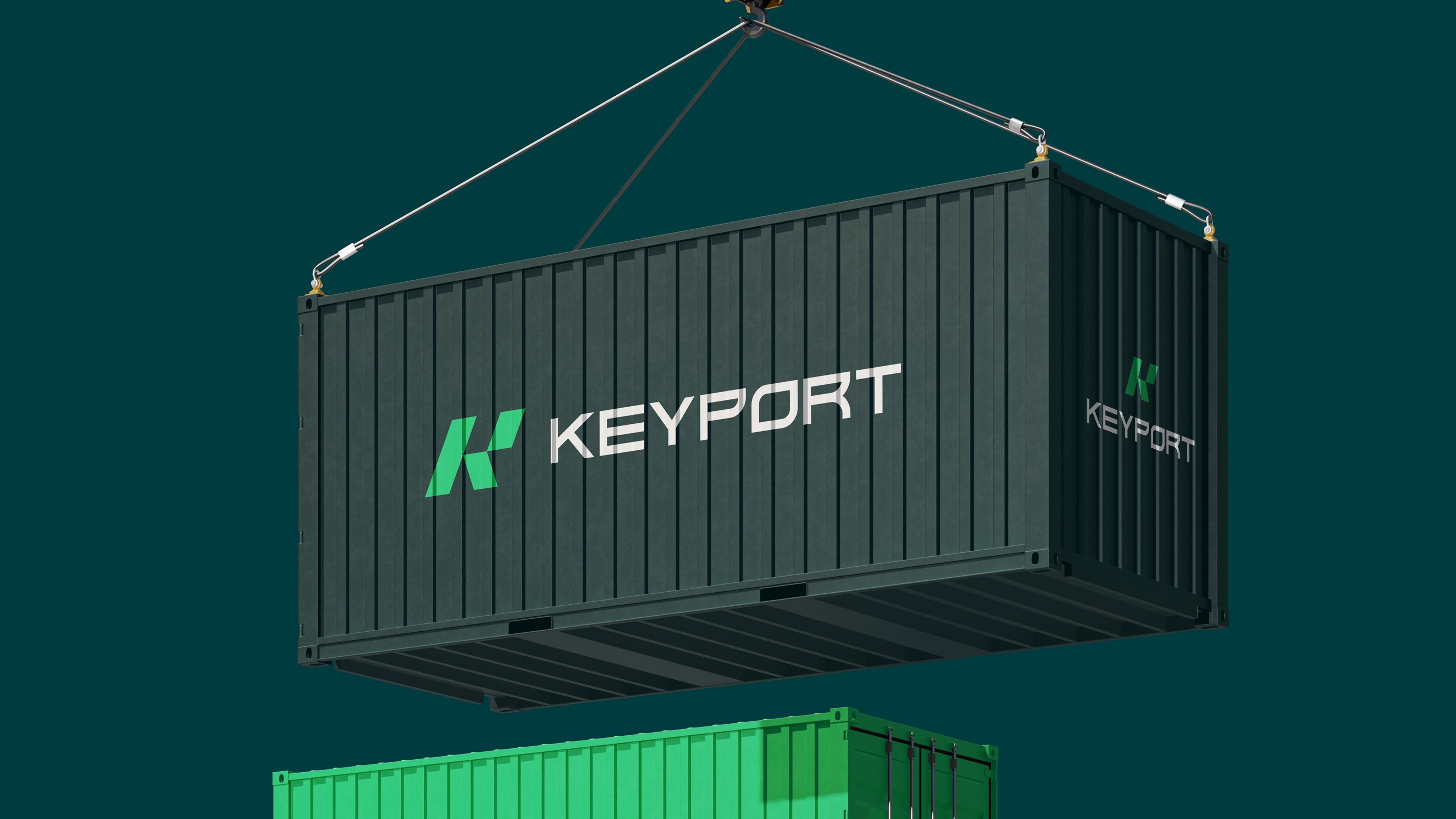
In designing the logo, we aimed to highlight a set of key attributes: modernity, simplicity, speed, and strength. We wanted these qualities to be reflected in the visual identity of KEYPORT. By merging the letters K and P, we created a distinctive, appealing, and straightforward mark. KEYPORT operates in the fields of shipping, customs clearance, and logistics equipment. Therefore, we aimed to emphasize the qualities of speed and safety in this identity through the font style and the use of slanted shapes, along with contemporary colors.
KEYPORT
In designing the logo, we aimed to highlight a set of key attributes: modernity, simplicity, speed, and strength. We wanted these qualities to be reflected in the visual identity of KEYPORT. By merging the letters K and P, we created a distinctive, appealing, and straightforward mark. KEYPORT operates in the fields of shipping, customs clearance, and logistics equipment. Therefore, we aimed to emphasize the qualities of speed and safety in this identity through the font style and the use of slanted shapes, along with contemporary colors.


Let's connect
Let's make some magic.
Ready to elevate your business? Fill out the form or reach out directly to discuss your next big project.
Let's connect
Let's make some magic.
Ready to elevate your business? Fill out the form or reach out directly to discuss your next big project.
Let's connect